
Mind The Gap
Project Type / Master Thesis in collaboration with Vy
Date / January - June 2025
Role / UX-Designer
Place / AHO, Oslo
Supervisor / Joakim Formo
Designing clarity and confidence during planned train disruptions
In Norway, train services are often replaced by buses during scheduled maintenance. While this is a necessary part of maintaining the railway system, it creates a moment of uncertainty for travelers: Where does the bus leave from? Will I make my next connection? What exactly applies in this situation?
Together with Vy, we explored how design could reduce this friction. Our goal was to support travelers in moments of disruption by giving them the tools they need to feel more informed, prepared, and confident – no matter how familiar they were with the system.


The problem
Through our early research, it became clear that the biggest frustration wasn’t the fact that the train was replaced – it was the lack of clarity about what to do next. Travelers struggled to understand where to go, how to get there, and whether their connection was guaranteed.
One of our interviewees said,
“I get that I’ve missed my connection, but I’m just curious – where in the app does it even say there’s a bus transfer?”
This sentence stuck with us. It captured a core pain point: a lack of clarity around transitions in the app’s travel details.
The solution
We’ve developed small, targeted improvements that bring more predictability to the moment of change – giving travelers quicker access to relevant information, clearer navigation, and support when decisions need to be made.
Quick actions provide travelers with a sense of control and efficiency when time and clarity are crucial.

Design Process and Insights
We started with fieldwork at Asker Station, observing travel patterns and interviewing both frequent commuters and first-time passengers. We examined how disruptions were communicated digitally, and how that information translated – or failed to – into the physical space.
What we saw was a mismatch between digital instructions and the physical environment. While the Vy app contained the necessary information, it was often buried or unclear. On the ground, signage varied or was missing altogether. This gap between the digital and physical experience shaped the rest of our process.
Through iterative design and testing, we began shaping interventions that could work across these touchpoints – small changes that, when combined, would add up to a smoother experience.


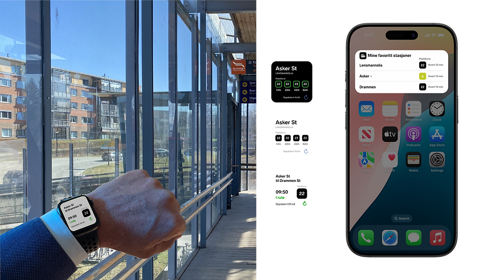
One example of this mismatch was a case where the Vy app listed platform 21 for a replacement bus from Asker to Drammen, while internal schedules correctly stated platform 22. Since platform 21 is normally used by the Airport Express Train, this created confusion among travelers and placed additional pressure on staff at the station.

With growing pressure on the railway system and an increasing number of travelers, bus replacements are becoming a permanent part of public transport. Vy has seen over 40% passenger growth in Eastern Norway over the past 10–12 years and expects another 20–30% increase in the next decade (Vy, 2024). To meet this demand, we believe it's essential to design for independence, predictability, and a sense of control—especially during travel transitions where users are often left to make quick decisions on their own.
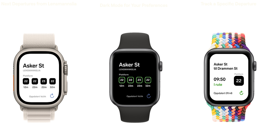
One of our design interventions was a step-by-step travel guide, fixed to the top of the screen throughout the journey. It activates during key transition points—like when transferring from a train to a bus—and works in sync with your ticket. The guide provides clear, contextual support exactly when it’s needed, without overwhelming the user.
We wanted to explore how small, supportive features can make transitions smoother—knowing that these moments are experienced differently by everyone. The goal wasn’t to explain everything, but to offer just enough help so the journey feels easier, more intuitive, and more manageable.

AR navigation & 3D maps
To build confidence before departure, we designed features that let users preview their journey. AR navigation, 3D maps, and station visualizations help travelers understand where they’re going and what to expect—before they even leave home.

Locked-screen support
To reduce stress during train-to-bus transfers, we introduced subtle guidance even when the screen is locked. Users receive vibration alerts and step-by-step instructions without needing to reopen the app. This ensures continuity in navigation and keeps the user informed and reassured—hands-free and hassle-free.


After exploring how we can support travelers through physical transitions, we shifted our focus to another key part of the journey: pricing. Smart pricing is designed to be intuitive and motivational – whether you’re a daily commuter or a first-time traveler.

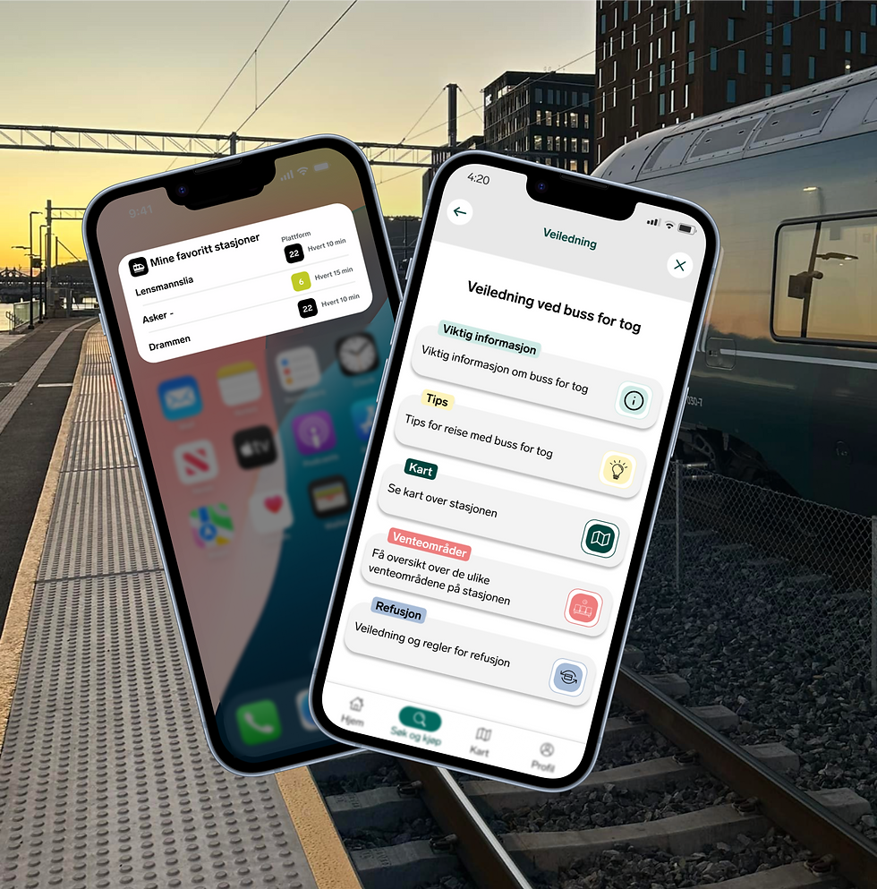
That early question about missing a bus transfer stayed with us throughout the project. It made us look closer at how clearly Vy’s app communicates transfer information, especially when connections are tight or uncertain. Our review showed that this crucial info was often hard to find or missing altogether.
To tackle this, we added clear messaging and an explanatory modal in the app that informs users when a bus connection can’t be guaranteed. This includes alternative travel options and a payment warning, helping reduce confusion and build trust.

To create a smoother travel experience, we also looked beyond the app. Physical interventions can make a big difference – especially in stressful moments, where clarity and flow matter most.

Fast Track – for predictable commuters
Many commuters know the system and want as little friction as possible. With Fast Track, we introduce express lanes for frequent travelers, enabling faster boarding and reducing queue buildup for both passengers and staff.
Through simple visual cues, QR scanning, and ticket linking, commuters can move on quickly – freeing up resources for those who need more support. The solution is scalable, realistic, and based on existing behavior patterns at busy stations.

Several users missed a clear connection between the app and the station. We addressed this by aligning visual language – using consistent colors, symbols, and terms like yellow signage – and designing tools like bus route templates and simple ID codes to improve clarity for both staff and travelers.
Final Designs, short on Accessibility and Inclusivity
The final designs focused on clarity, control, and contextual support. A widget gives travelers an overview of their route and upcoming steps. AR elements guide them through unfamiliar stations. Modal alerts communicate risk when needed.
Accessibility and Inclusivity
All designs were tested for readability, cognitive load, and usability in motion. Solutions are built to support both experienced and first-time users – and adapt to varied travel situations.
Outcomes and Reflections
This project deepened my understanding of public transport systems and real-world complexity in travel design. It showed me how small, thoughtful changes – informed by honest user insight – can make a big difference.
Note: This project was originally written in Norwegian, as it was developed in close collaboration with Vy and grounded in local transportation challenges. For this portfolio, it has been translated and adapted for an international audience.


